
Case Study: ManiLife - Peanuts
Brief.
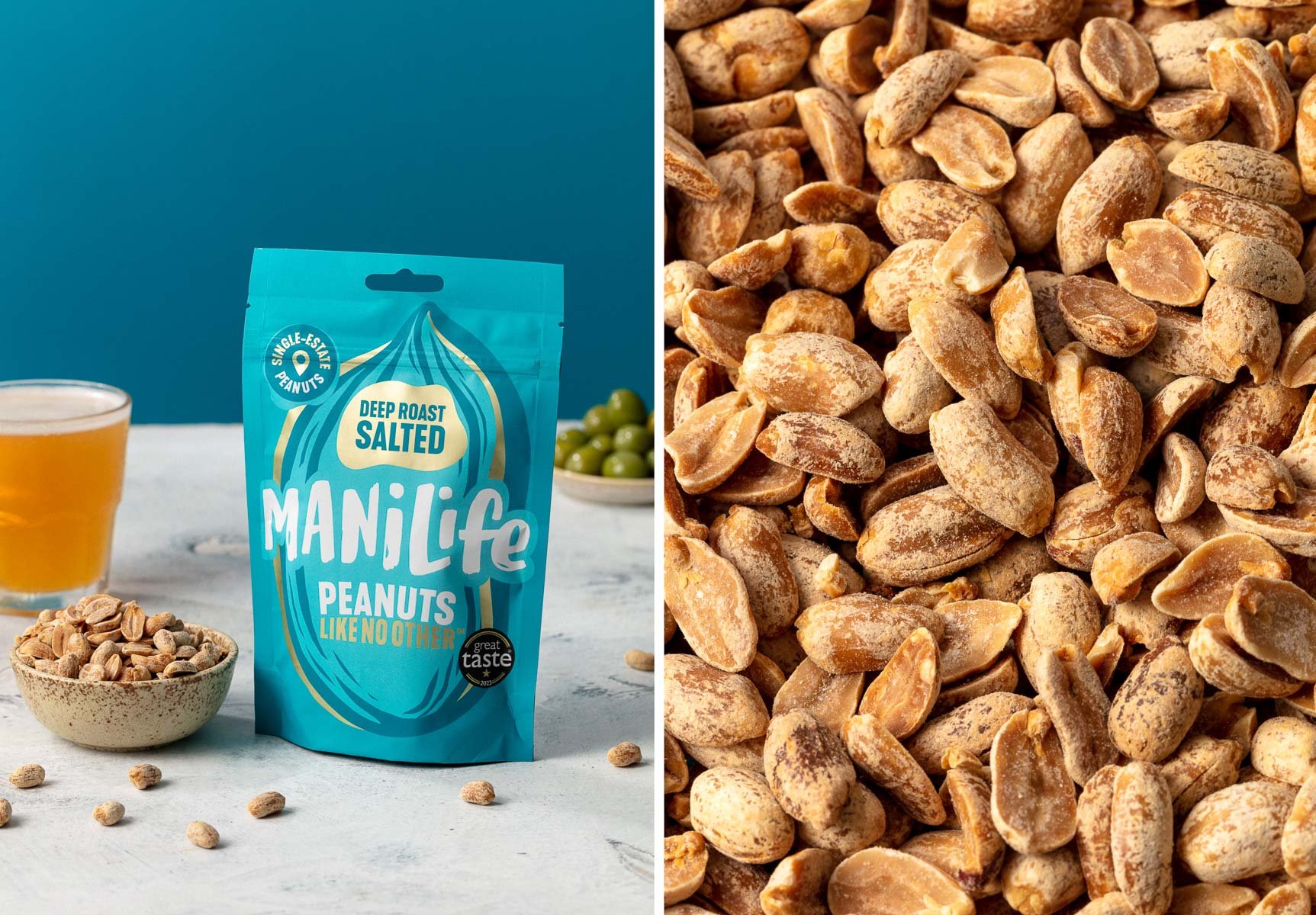
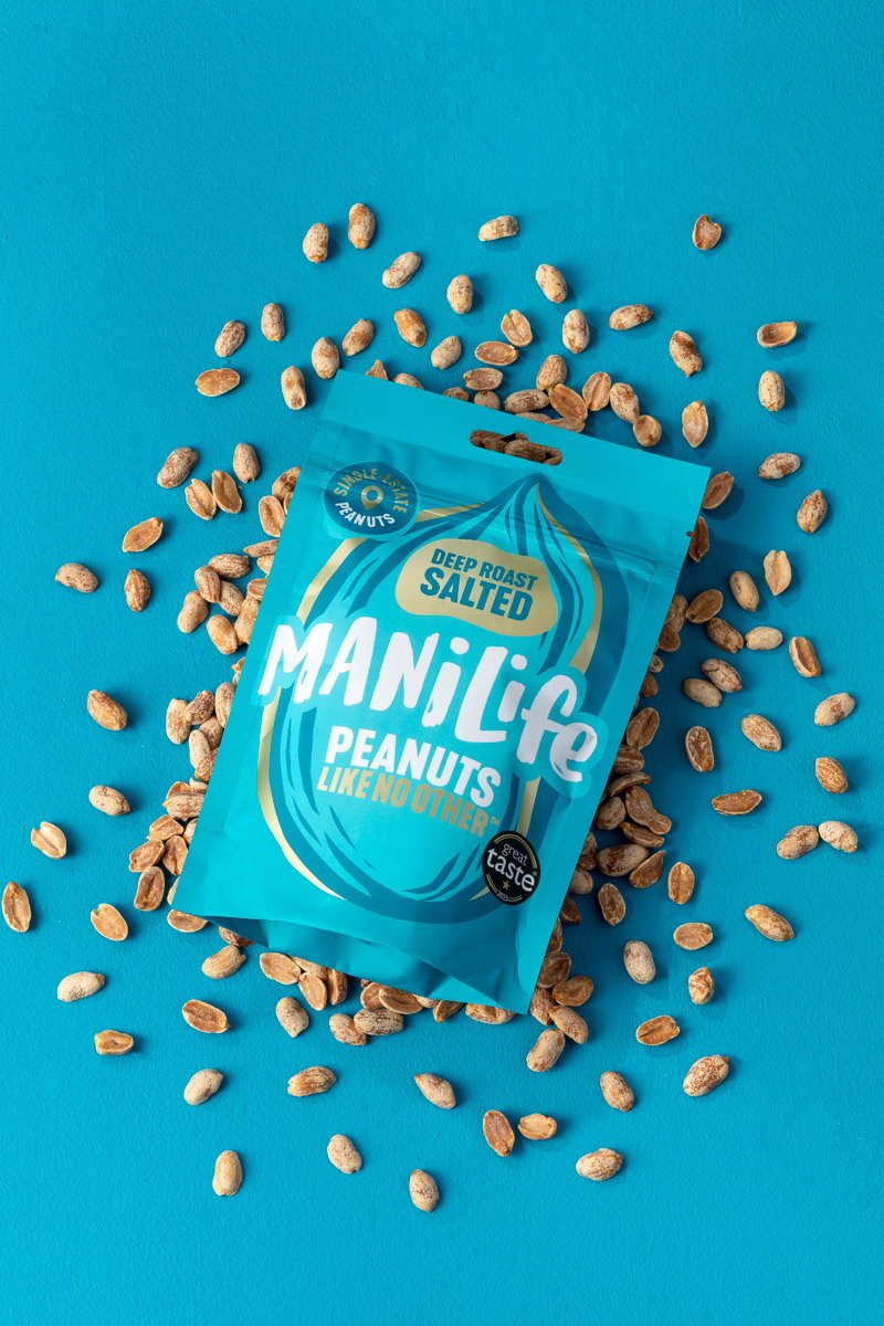
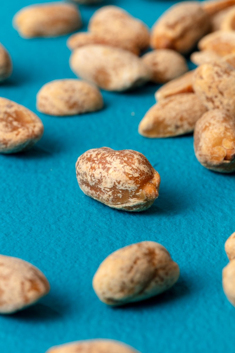
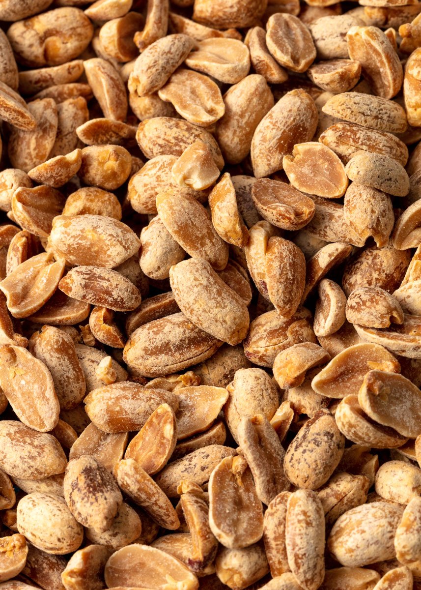
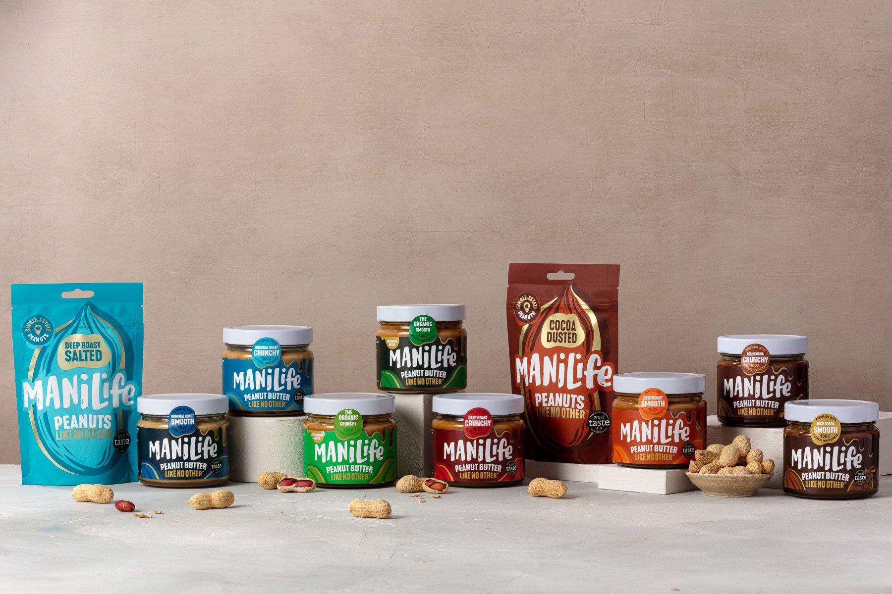
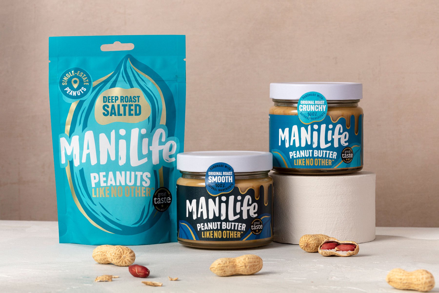
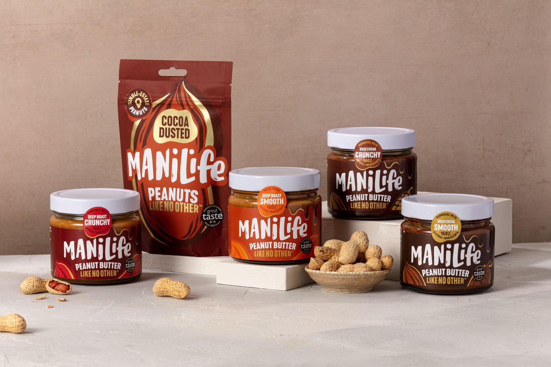
Based in London, ManiLife are popular brand - known for their range of peanut butters that are made of single estate peanuts from Argentina.
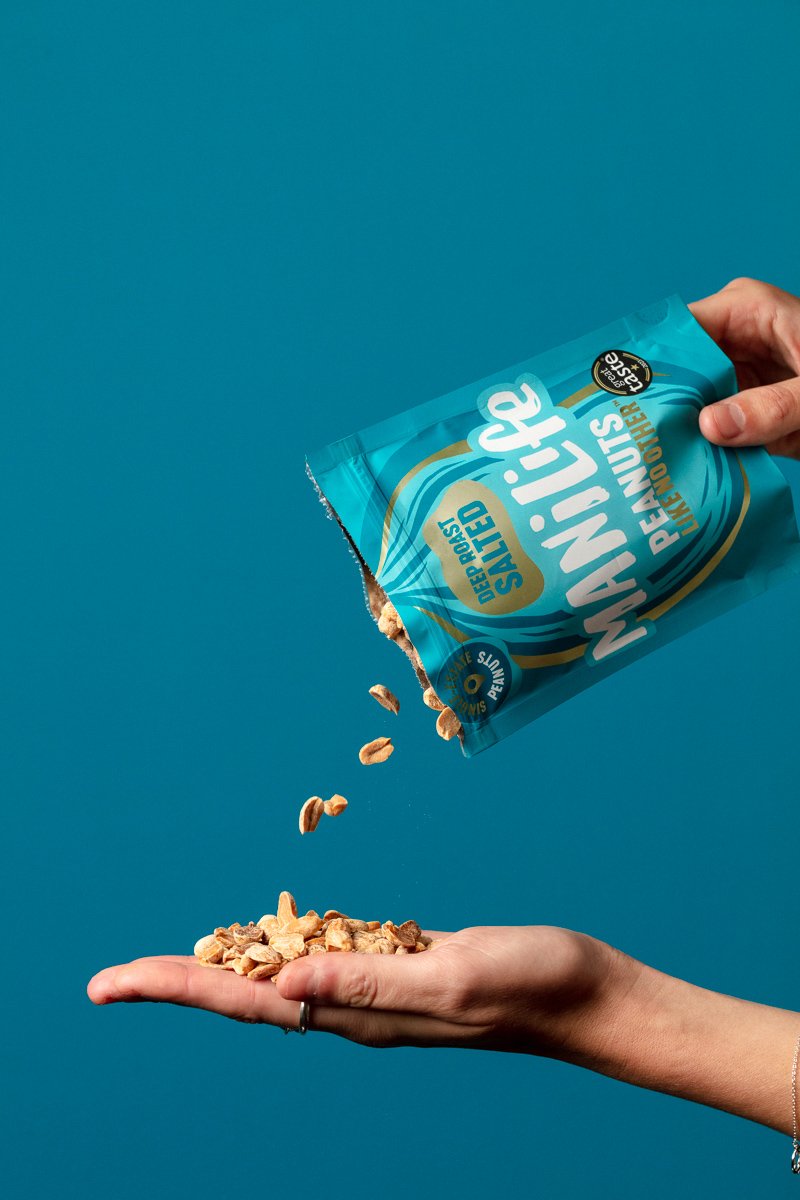
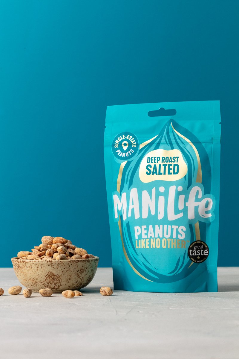
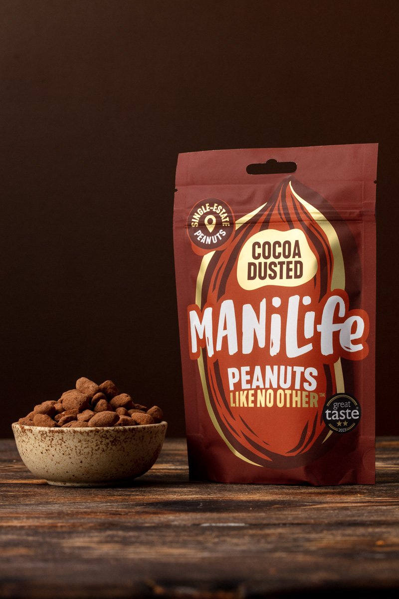
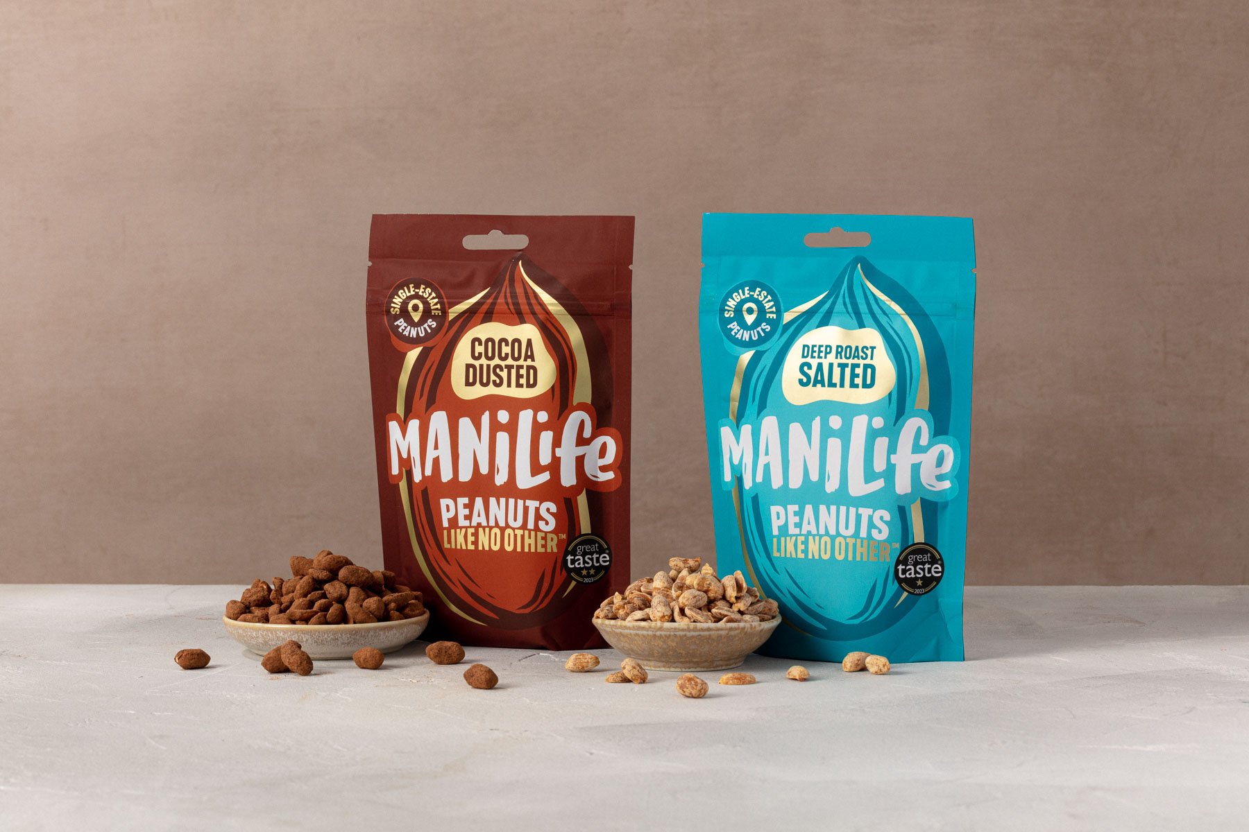
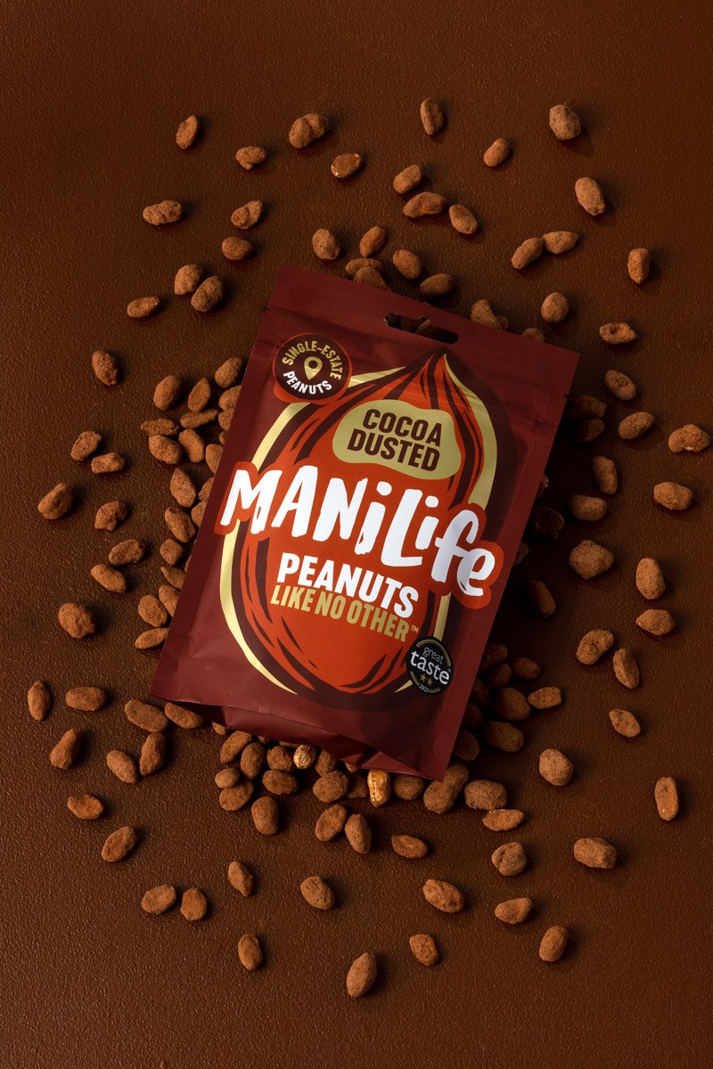
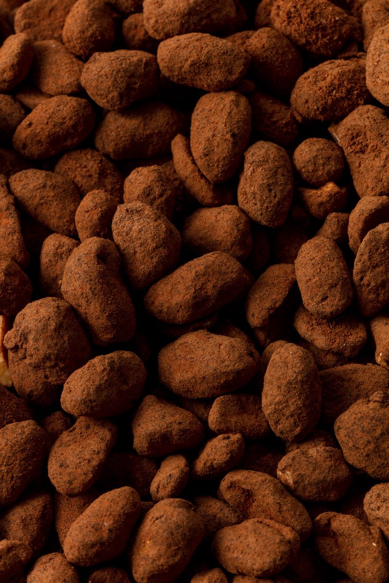
With their popular snacking peanuts launched earlier in the year - the brand team decided to redesign the packaging to stand out on the competitive shelves of supermarkets and stores; the secondary focus was in being more consistent to the rest of the brand’s packaging.
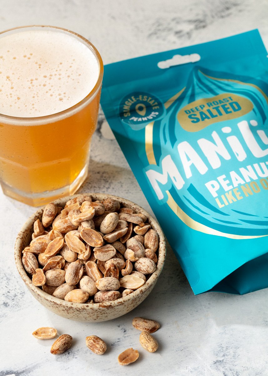
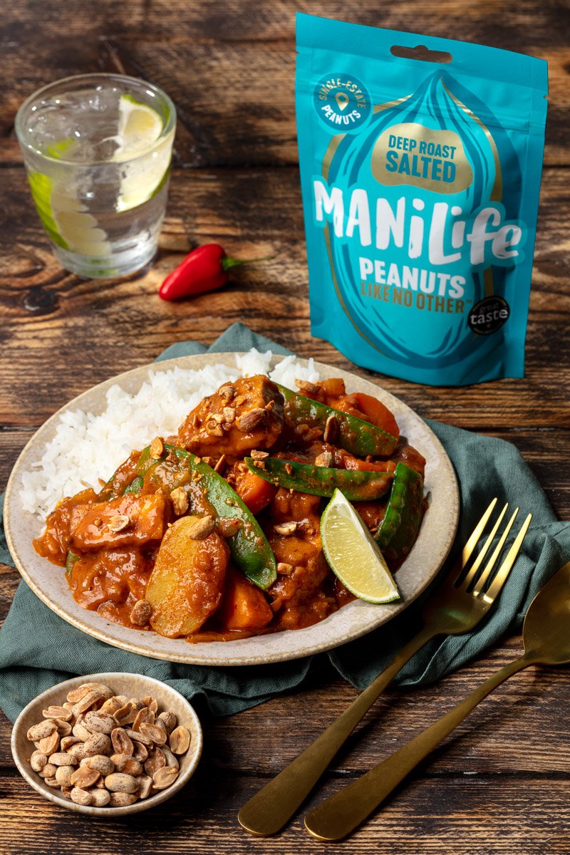
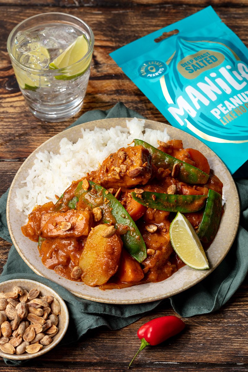
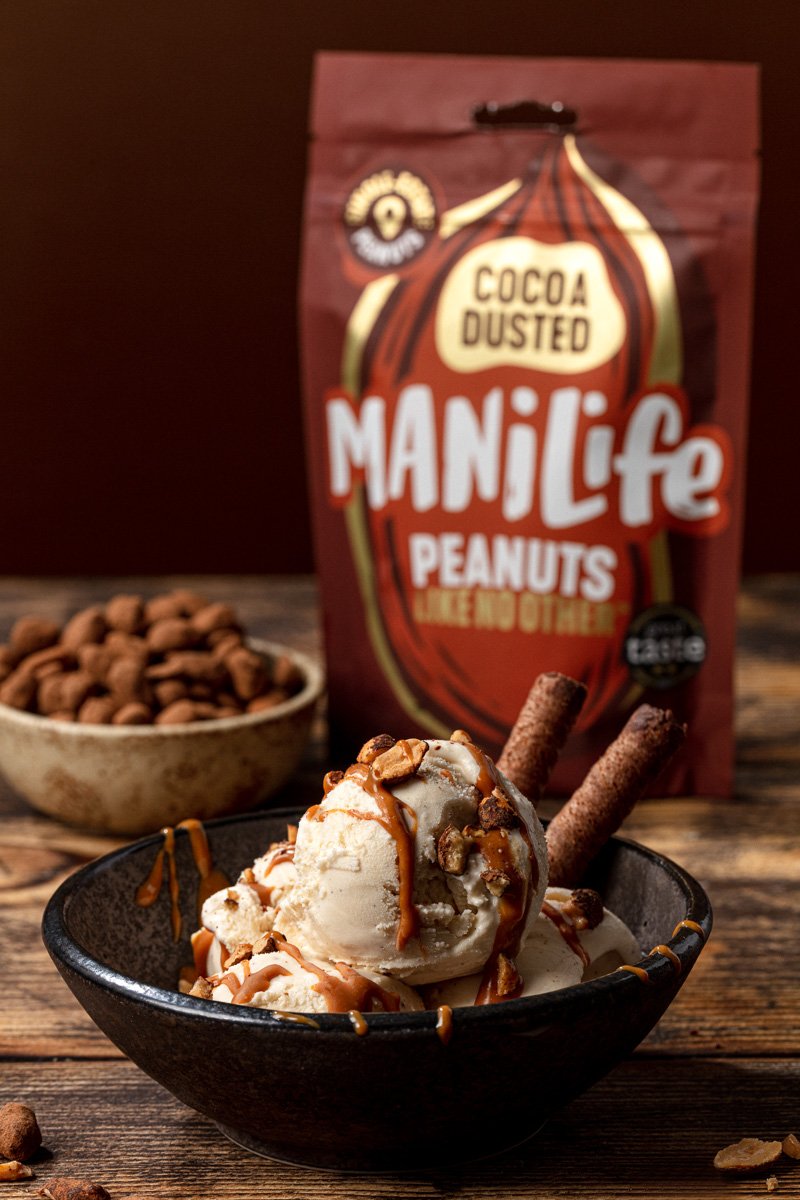
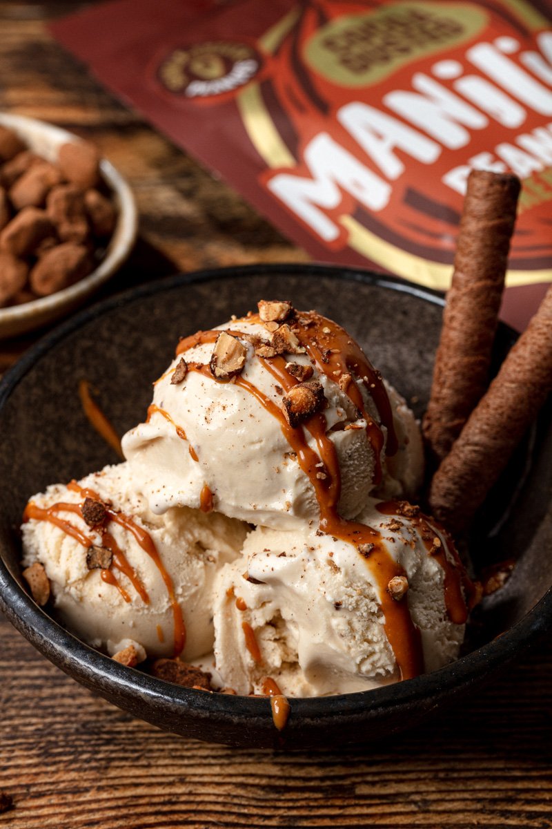
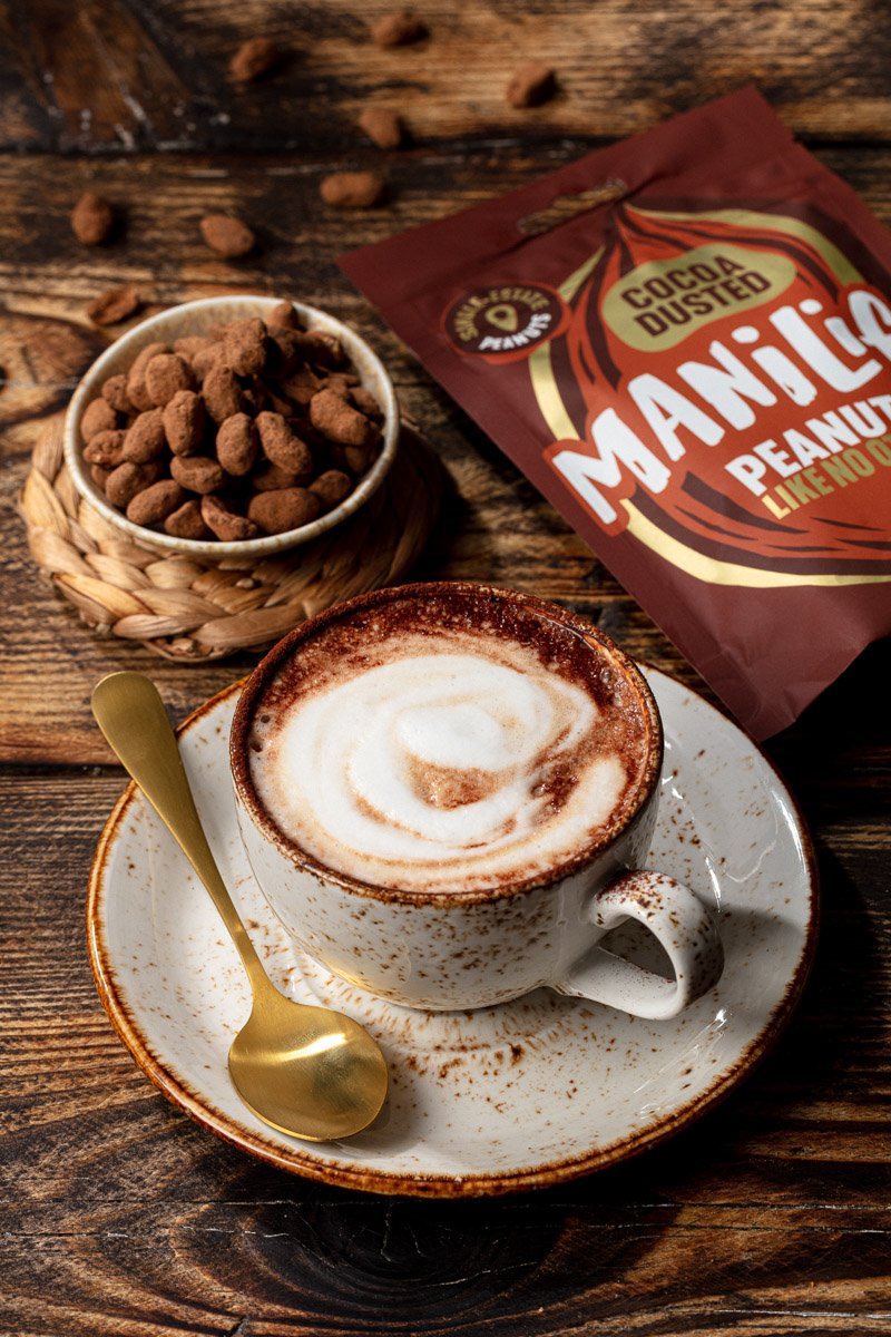
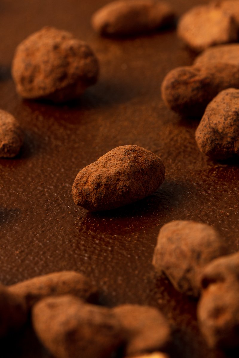
Off the back of two other shoots in six months, the ManiLife team briefed me to capture food photography of their product paired with recipes, packshot product photography, and simple imagery of the whole redesigned range.
The key usage was for their website, Amazon A1 pages, digital touch points and for use across press.
Approach.
I kicked the project off with a discovery form - having the client fill it in and then ran through it with them to take on learnings and to better understand their food photography brief.
I developed this into a brief treatment, that had a production overview, mood boards, art direction x recipes and a shot list. Recipes were selected, and sets were built using colour theory, custom-painted backgrounds and props hired in from the prop house.
Shot over a one-day session - I split our shooting time into 2/3 recipe pairings, with 2 x products and 1 x recipe each, and smaller sub-scenes to make use of the set dressing for their food photography
The remainder of our time would be put into packshot product photography, with a minimal amount of props and set dressing to keep the focus on the product packaging.
Retouched and delivered, the client’s were super pleased and it’s amazing to see the content now being published.